Archive for the ‘Paper Diva’ Category

Spur Shooters: Behind the Scenes

Friday, July 1st, 2011

We had a good time shooting Denise & Jameson.  Here are some behind the scenes shots to paint the rest of the picture:

One of the 1st shots of the happy couple…good job Handicapped sign!!


Elise & Kristy came with us!  Good thing they’re iPad fanatics!

(more…)

Spur Shooters

Thursday, June 30th, 2011

This past weekend Marc & I did our 2nd engagement shoot.  We had a lot longer than last time to shoot.  We used every minute.

We shot an adorable couple, who might as well be a real-life cowboy & cowgirl.  They met on eHarmony and things moved swiftly into a beautiful engagement.  And who knew asian guys could own Buicks, wear ostrich boots, fancy belt buckles, and carry a cowboy hat wherever they go!?  The bride-to-be admitted they hardly have any photos of them together! We sure fixed that.

We shot with a few props and stumbled into a semi-styled shoot. I’m always reading about styled shoots…and as I reviewed our shots, I realized my subconscious shot the couple as if we were following them around on their ranch. With the entrance of a mere cowboy hat and a few square dancing moves, it transformed this shoot into something magical and western.

I shot with 3 different lenses. 50% was shot with my new 30mm 1.4, 35% with the trusty 28-75 2.8 and the remaining 15% was shot with a 10-22 (which was my first time snapping shots with this lens).  My favorite to shoot with was the 30…but I am intrigued now with the 10-22.

Here are some of my favorite shots.

Tamron 28-75mm 2.8


(more…)

Mrs. Paper Diva – Project 2 – Beach Elegance

Friday, August 20th, 2010

As I gladly accepted role of bridesmaid (for the first time in my life :))…the ideas started going off in my head like firecrackers…and quickly I blurted out,

“I will help you with your invitations.”

And so the consult started.

Client: Charlene – The Bride

Setting the scene: Fancy fall wedding at the beach–“Beach Elegant” says the bride
Colors: navy, silver, beige– “night, platinum and sand” says I.

We get together and pull up chairs to the workshop table at Papersource (of course).  I pull all sorts of potential paper from stardream metallic sapphire (reminiscent of the robots), textured cover, pure white cardstock, vellum, washi…it was all over the table!  All the sudden the Bride’s eyes lit up like a girl on her first trip to Tiffany & Co. Then I knew it, the paper bug bit her.  From then on, she became infatuated with the alternate universe where paper rules all.

After strolling down the aisles of Kelly Paper (a wholesale paper warehouse open to the public) and Papersource, staring at the Papersource paper size chart, and an hour back and forth of “what do you think of this…” the Bride had made her decision.

Main Invitation: (blurred because you’re not invited)
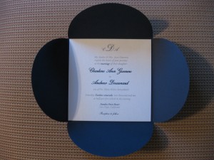
5″x5″ square 110 lb Curious Metallic cover stock in ice gold (bright ice metallic with gold shimmer when it hits the light) printed in thermography by The House of Printing in Pasadena.

Mounted on a petal enclosure inner envelope in night with standard 3m double-sided adhesive tape.  Font color choices were night (pantone 648 U) and platinum (pantone 877 U, the only metallic silver in the pantone chip book).

Tip: to have full control of your project and to save money, have your invitations printed at a professional print shop.  Your alternative is paying at least double at a invitation retailer/design house.  Get access to a pantone chip book so you can choose the exact ink colors.  Each shade of color in the world has its own unique pantone color!

Reply Card
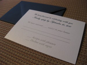
3″x5″ square 110 lb Curious Metallic cover stock in ice gold printed in thermography/raised printing by The House of Printing in Pasadena.  Paired with a 4 bar envelope in night.

Stamps

We think of everything!  The stamp on your envelope even makes a statement.  The Bride chose the wedding set USPS.com is currently offering.  They’re getting difficult to find at the post office…buy online!  Its just $1 to ship.

Map
The Bride is a graphic designer (in addition to being a former member, she is Drifting Pretty’s guest graphic designer from time-to-time), so she designed from scratch a beautiful map.  She printed it in full-color on transparent vellum.  I don’t prefer to mix printing styles (ie thermography and inkjet) but this would be the exception, as inkjet on vellum looks quite elegant and soft.

Invitation Presentation
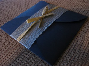
To incorporate the beach in this elegant ensemble, the Bride chose  raffia ribbon in natural to tie on a beautifully diamond swatch-textured platinum paper ribbon.  This couple acted as a wrap to close the inner petal envelope.  The inner petal was then inserted into the main 5 3/4″ envelope in stardream silver.

The Final Show
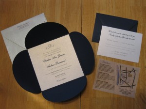
The final ensemble was a harmonious one.  75 invitations and 4 hours later, our mission was accomplished: Beach Elegance was found.

Notes
If you’ve gotten this far in my post, you’re crazy, AND you are now hereby accused of being in love with paper!

The total project cost (printing, accessories and paper) was a mere $400 for 75 custom invitations.  Go to any invitation design haus, you’re going to spend much more.  With inspirations (like the venue, season and time of night)  and your creativity, a project like this is a breeze!

Thank you to the Bride, Char, for allowing me to share our project with the world.  Wedding day is fast approaching…now on to favors!!  Cheers to paper and Beach Elegance!

Mrs. Paper Diva

Thursday, August 12th, 2010

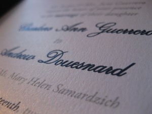
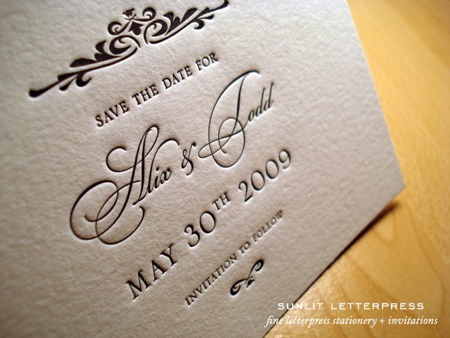
Besides being a Drift Queen, I do have other hobbies.  I’m known as the Invitation/Paper Diva.  I jump at any chance I can get to help friends with wedding invites, baby shower invites, favors etc.  It all started back in 2001 when I got a job doing accounting for a high-end invitation design-house & factory.  They specialized in the super fancy “letterpress” style of printing, which uses the same methods from 500 years ago…where they ink rollers and emboss (using a metal plate fitted with your choice of design) into a thick piece of cardstock…you get beautiful indentations that are inked in color. Like this:

Over the years I kept the knowledge near and dear.  At my age, everyone is either getting married or having a baby.  It makes some people sick, but for me, I think “yay paper time!”

Working in old town Pasadena, almost daily, I trot into Papersource to peruse.  I’ve accumulated quite the collection of paper ranging from fancy metallic cardstock to Japanese washi paper– its getting out of hand!  What better way to spend my evenings from time-to-time actually putting the paper to work and helping friends out.

Current Project – Baby Shower Invitations & matching favors


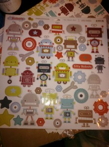
I found these My Mind’s Eye robot-themed 12×12 chipboards (thick cardboard with pre-punched shapes)

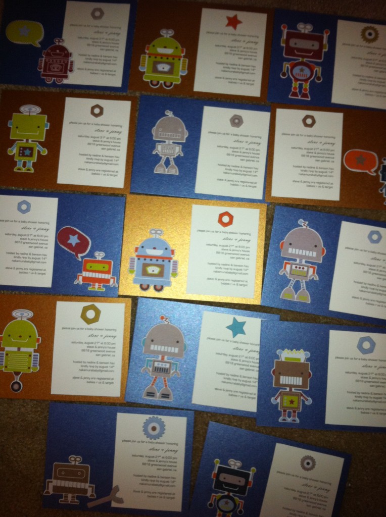
Gathered some A6 Notecards on Stardream Metallic sapphire & antique gold from Papersource (of course)

Laser printed a robot-themed type-face (eurostile) on ultra smooth white cardstock

Put it all together and voila…

Hah, it wasn’t that easy!  But it was definitely fun putting these together.  Every single invitation is its own unique piece of art.

Favors – a work in progress

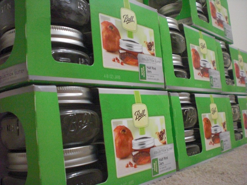
I didn’t want to go too typical and do plastic 5oz baby bottles filled with candy…so I looked around at small boxes and jars.  I was lost.  Then at Target of all places and Benson of all people, helped me find these fantastic mason jars.  Elegant enough for a wedding…but my friend deserves a higher caliber favor at his baby shower right?  So at $4.19 per 4 pack…I thought it was a great deal.

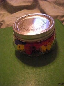
Benson came up with a great idea to fill it with Legos.  I was about to run with it.  As I tested it out, the jars were way too elegant for Legos.

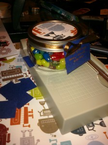
I ended up using the dad-to-be’s favorite candies: Jelly Bellies & Lemonheads.  I’m still tracking down a good deal on Lemonheads…but the Jelly bellies are done:

Candies seem so cliche…but what the hell else are you going to fill the jar with when you’re on a budget?  I figure this way the guests can enjoy the candies then re-purpose the jar as an apothecary jar (like a q-tip jar) or a jar for the loose nuts and washers that are constantly left over after working on their 240sx.  Dual purpose!!!  Yummy candies and something they can keep and use.

Mounted to the top of the lid is a 3″ circle cutout of matching robot paper.  To get a clean circle cut (I am NOT using an exacto to do this!!), I purchased a 3″ Fiskars punch which was luckily on sale for 30% off at Joann.

Next is the tag.  Its a work-in-progress.  I’ve purchased a tag punch.  We’ll see how that looks using stardream sapphire tags inked with a Sakura Gelly roll gel ink pen in gold.

T-minus one week to finish.  Wish me luck!

PS. I hate my squealing brakes.